
Green Machine is a large scale project across my undergraduate and graduate study. The goal of Green Machine is to design a solution that improve waste sorting efficiency. The project contains two parts: part one focuses on encouraging people's mindfulness at the time of disposal; part two focuses on intelligent and automatic waste sorting receptacle design.
Project Topics:
Human Centered Design (HCD)
Design for Environment (DFE)
Smart Trash Can
Waste Reduction
Behaviour Change
Personal Contributions (Part One):
Logo Design
User Research
UX/UI Design
Software Engineering
Personal Contributions (Part Two):
User Research
Product Design
3D Modeling/Rendering
UX/UI Design
Video Editing
Part One - UNIVERSITY OF WASHINGTON
In the Human Centered Design & Engineering (HCDE) capstone project at UW, I met EvoEco, a startup company making informational display system to educate people how to sort trash. As my sponsor, EvoEco gave me the following design challenge:
How can we design a waste management solution which encourages mindfulness at the time of disposal?
Six month later, I presented this to EvoEco at the HCDE open house, and the project received People's choice award among over 20 design projects.
Research
All design projects start with the research. To learn current waste management solutions, I conducted a comprehensive research with my team around the University of Washington, including field study, online survey, and interviews.
Step 1: Field Study
At the beginning of the project, the team went to all buildings at UW marked with purple to conduct field study. Hundreds of photos were taken, nots were collected, various designs of waste receptacles were learned.


The field study revealed that UW has incredibly inconsistent waste receptacle designs, including shapes of openings, form factors and signages. However, after a lot of digging (yes, literally digging), we discovered several designs that resulted in better recycling and composting efficiency. Here are the product requirements we learned:
The openings of the receptacle need to be designed in a way that guides users to dispose right waste
The color coding needs to stay consistent to avoid confusion (Blue = recycle, green = compost, red = landfill)
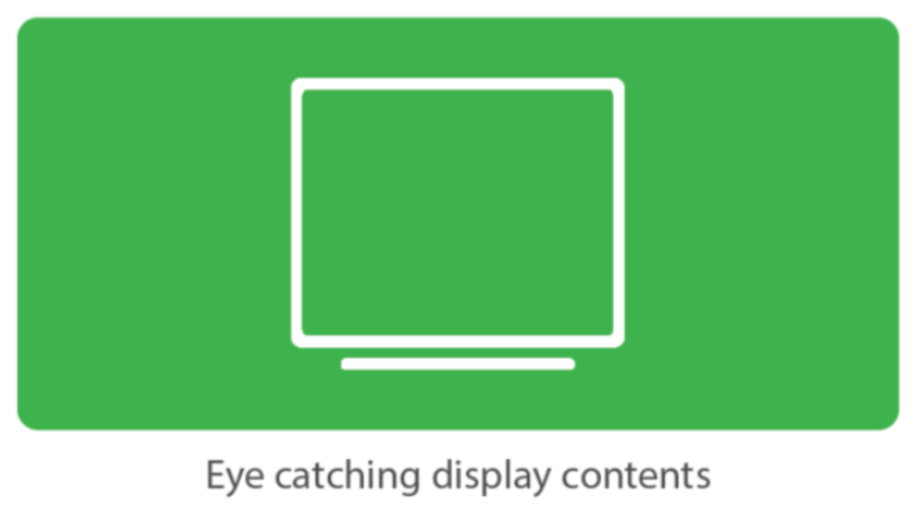
The signage needs to be large and eye catching to effectively educate users to properly sort their waste
Step 2: Online Survey
After the field study, the team designed an online survey aiming to find out the pattern of how students dispose their waste. We first designed a short quiz to test how well students know what waste belongs where, then a psychographic questionare to learn their opinions on waste disposion. The survey received 176 responses. We gained many valuable insights of student's behavior. During the data analysis process, I proposed a cross-compare method to further filter the patterns of student behaviors. For example, for those who scored low in the quiz, the psychological data might show a different pattern than those who scored high. The method turned out to reveal more insights (see overall research findings below).


Step 3: Interview
To learn the reason behind students' behavior pattern, multiple interviews were conducted. I chose semi-constructed interviews because I would like to get all the information that I needed while keeping the conversations open for new ideas. Some important insights that I collected are:
"I'd like to associate blue with recycling, green with compost, and red with landfill, but usually I stil have to read to make sure"
"When I am not sure about where a certain item should go, it is very hard for me to find information on the signage or poster"
"I didn't even know the university is doing this. I thought it's the government's job."
"How clean is clean? Is liquid clean? What if I have a bottle with detergent in it? Is it clean or dirty?"
"I know there must be something to do with the land, but I didn't know that they just bury it"
Overall Research Findings
Decision making
Students who spend more time deciding where their waste goes make correct choices more often
Students start thinking about how to dispose their waste before reaching the waste receptacles
Graphic elements is currently the most effective representation that helps people to make decisions
Students who are less knowledgeable in sorting waste are overconfident about themselves.
Waste Receptacles
Arrangement of waste receptacles play significant role in how students utilize them
Text and shape of waste receptacle openings should match and stay consistent across campus
Students receive their first cues of where whey will throw their waste based on the shape and color of receptacles
Students often cannot rely on the signage to make their waste management decisions
Demographics
Students with higher class standing, with the exception of graduate student, tend to do better at sorting waste
Knowledge
Students do not have clear idea about how the waste will be treated after they discard it
Students found it confusing to classify some of the common items, such as plastic products, food contaminated items, and paper products
Design Implications
The research findings provided us with design implications. To address the problems we have identified from the research, we focused our design in four aspects:

Prototype Development
Step 1: Display Animations
To address the need of informational & educational content, I designed over 10 animations that loop the display, educating users both the stake of waste management and how to sort their waste. The digital contents were divided into 2 sections:
Why should you sort your waste?
How to sort your waste?

Because the display held the responsibility of both raising awareness and education tool, the diversity of the digital contents was essential to the success of the product. As the result, I chose the following topics to produce contents of:
Since people don't usually stay after disposing their waste, videos had to be short but eye catching. Thus, I utilized information visualization methodologies to produce those animations:
Keep all videos under 15 seconds long
Use motion/animation to attract people nearby
Use data to increase our credibility
Use photos/videos that provoke emotions (like the bottom right picture below)
Avoid too many words (people won't read them)
Watch the complete playlist of animations here.
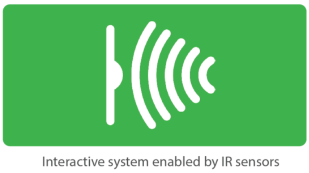
Step 2: Interactive Systems (IoT)
Interactivity is an important differentiator of Green Machine compared to other display enabled solutions. The initial design was an image recognition function. According to this concept, a camera hidden inside Green Machine would detect the waste and decided whether people sort it correctly. However, since our goal was to make a functioning prototype, the programming work required for such feature was beyond our scope. So, we decided to not focus on the technical aspect but to concentrate on what we were able to achieve. Then I came up with a plan B, which is to use Arduino and Processing to count how many times each receptacle is used to acknowledge the collective effort in a community. It wouldn't be as effective as image recognition, but it would potentially increase the mindfulness of people disposing garbage at Green Machine.
Three interactions make Green Machine effective:
The infrared sensors installed on the inner bins will detect the motion and send signals to a raspberry Pi
Then Processing, the display software controlled by the raspberry Pi will register the action and display numbers correspondingly. The goal is to visualize the collective efforts done to the waste receptacle, encouraging people to avoid using landfill
The smiling face located on the top right corner of the display reacts to people's actions correspondingly. It cheers when people dispose waste to compost and recycle
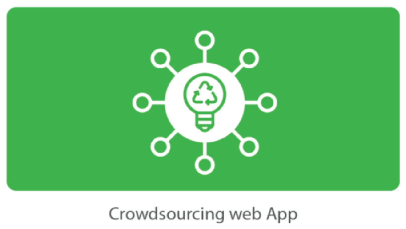
Step 3: Crowdsourcing Web App Design
The goal of this web app is to create a crowdsourcing platform to collect information about waste sorting. Knowing that waste can have various shapes, colors, and forms, we could not create comprehensive list of waste sorting tutorials. Hence, we decided to encourage users to submit their items and eventually build a "Wikipedia of Trash". Through computer programs, we could then automatically generate video content for the display so that users won't get bored seeting the same videos everyday.

Low-Fidelity Prototype


User Testing Feedback
Crowdsourcing concept is accepted by most users
Share feature enables users to share their contributions to social network
The visual needs to be engaging enough to persuade users to the web app
Lack of porters to direct users to our web app
Users don't really read the news
Final Product
The final prototype is consist of a functional physical component and high fidelity digital wireframes
Physical Prototype

As the main focus of this project, the physical component is an integration of individually painted cardboard garbage bins, specially designed shapes of openings, infrared sensor enabled counter and a monitor to display animations.
Digital Prototype
The wireframes were shown separately during the presentation


Conclusion
Green Machine turned out to be an insightful solution to increase people's mindfulness at the disposal. The display attracts many people's attention during the open house; the sensors and counters effectively encouraged people to dispose more often to compost and recycle than landfill. As a result, Green Machine received the people's choice award at the HCDE open house 2017. However, future research is still needed to examine the design, such as energy efficiency and percentage of correct waste disposal.
Part Two - Carnegie Mellon University
At the Carnegie Mellon University, I received another environment related project topic, Design for Environment. The project focuses on industrial/product design instead of interaction design. I believe this was an excellent opportunity to extend the design of Green Machine and to think about waste receptacles in a new perspective. Two months later, I presented this to the class:
Step 1: Concept Development
Instead of focusing on people's behavior, the new design team decided to focus on a larger perspective, the entire waste management industry. Waste management can be divided into three steps: collection, pre-processing, and end-processing. The new Green Machine decided to focus on the collection phase.
Step 2: Industrial & Interaction Design
The team first sketched dozens of ideas about the physical forms of the trashcan, then evaluated the feasibility of each idea.
Aside of the design of physical form factor, the team also designed the visual elements of the display on the product. To serve the goal of engaging interactivity and enhancing mindfulness, the goal of the GUI was set to provide positive reinforcement to users who dispose compostable and recyclable waste.

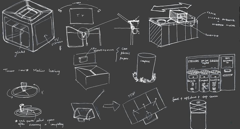

Since the new team was comprised of an architect, an industrial designer and three engineers, the focus was completely different from the UW team, where four team members were all interaction designers. The new team had more diverse backgrounds and hard skill set so that we decided to design an intelligent and automatic mechanism to sort the waste rather than just encouraging people to do it. After the initial brainstorm, two mechanisms were left to be decided: linear motion and rotational motion to drop the trash into respective bins. Then I and another mechanical engineer simulated both mechanisms with Solidworks to evaluate the feasibility.


Finally, the simulation revealed that linear motion required less proprietary parts and was more energy efficient. In addition, I researched possible solutions for image recognition. Then I realized that there were multiple APIs that we could utilize to recognize objects with a camera. Finally, the design was complete:
Step 3: CAD Design and Rendering


Material Selection
ABS > Aluminum: The original idea was to build an metal trash can to ensure the durability. However, in Solidworks simulation, Aluminum yielded a result of sheer cost and weight. Therefore, we chose ABS instead. ABS is a common plastic material that is durable, easy to mold, and recyclable
Transparent housing: To improve user's awareness to waste sorting and the technology we are using, the top housing was designed to be transparent so that people could see through the receptacle and watch the mechanism
Chamfered 45 degree display placement: Since the trash can is 36 inches tall, users would look at the screen downward. A chamfered surface facing upward is a better ergonomic design for the viewing angle
Image Recognition
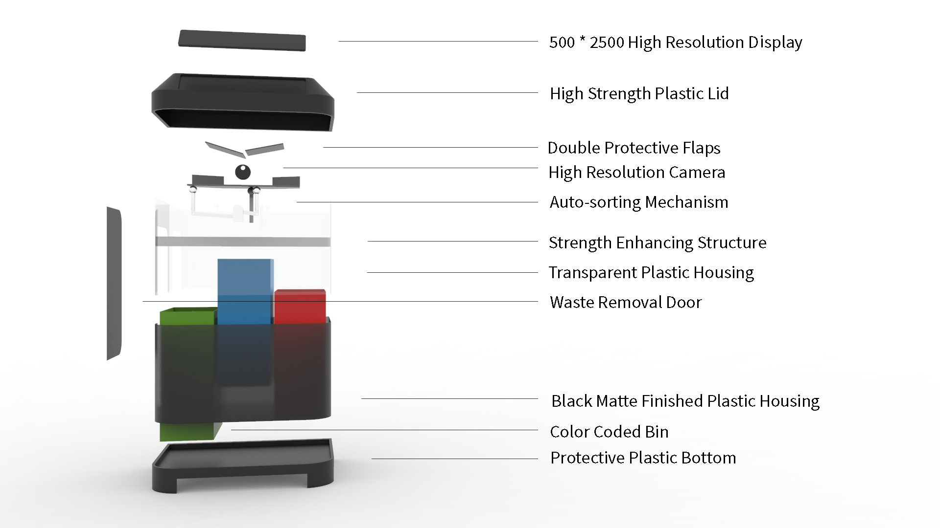

The camera equipped inside the trash can will detect the object and send the image to a image recognition platform (such as Google lens API) then receive information about where the item should go
Auto sorting Mechanism
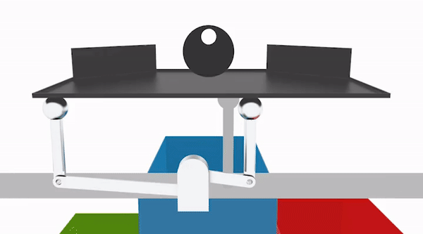
Rotation joint is used to tilt the tray in three angles. This design utilized a simple motor and fewest parts to achieve the sorting objective

The graphic user interface was a huge improvement from the initial Green Machine, switching a giant LCD display into a more energy efficient TN panel. Taking advantage of the 5:1 ratio, the display was divided into three sections. When the garbage is sorted, respective section will display an indicator.
Life Cycle ASSESSMENT (LCA)
To achieve the goals of protecting the environment, the product itself must not damage it. It is important to conduct the LCA to understand the product's environmental impact. During the design processes, the ecological cost of manufacture, transportation and energy were always considered. The sustainable mind tool provided an overview of the product's Ecological damage, carbon footprint and material use impact, and the result was outstanding


Testing
The team showed the concept to multiple CMU students and gathered valuable feedback. We also researched potential integration methods to other waste management systems
Usability Testing Feedback - Pros
Mental energy saving. Users don't need to think of where their waste should go by themselves
The product is visually appealing. It can easily draw attention and raise awareness
Transparent housing makes the internal mechanism easy to observe. It might also help for future repair
The display draws people's attention, increasing their mindfulness
Usability Testing Feedback - Needs Work
Users feel difficult to see the mechanism when standing next to it
GUI takes some time to understand
“I don’t want to touch the flap.”
Round edge and the size of the side door would limit the size of inner bins.
“What if someone throws gum in it?”
Conclusion
The new Green Machine was a unique approach to think about the waste management processes. Instead of educating people to sort their waste, it acknowledges the most advanced technology in image recognition and automation to sort the waste by itself. Although the feasibility still needs further investigation, the design is a forward thinking of possible solutions in the future.
“Because in a world with limited resources, some things can’t be replaced”
Other contributors:
Part One: Devin Bell, Luis Gonsalez, Valerie Huang
Part Two: Aishwarya Chogare, Mohamed Yassin, Olivia Roy, John Vanderveen, Xiaolin Yang